These are the final 4 variations that I have sent to Warner and the band for feedback. I am expecting to have to make some changes, but I will have to wait and see what there response is....
I am going to work on the design for the reverse once I have got approval for the front and have the exact sizing details.

Wednesday, 30 November 2011
development
This morning I reviewed the work and decided that I might try a different typeface. As the design is hand drawn this will mean redrawing the middle portion so that I can add different text on top. I experimented with the fill content aware tool but it didn't work too well so I redrew this area and experimented with a new typeface I acquired off Chris which I think will work well with the aesthetic of the design. I ended up customising the type and removing elements of it which I think works really well and looks really contemporary.
Mannakings ep
Feeling altogether displeased by almost everything I have done so far, I decided to rework the only design I like. I reviewed it and decided to expand on the design - make it more visually interesting and more imaginative, rather than sterile and repetitive as I felt it was at that stage. I like the new version so far, and have experimented with a variety of different background textures rather than images which I think works better.
laser cutting text
Today I had my first laser cutting session for Fedrigoni. This session was purely experimental - with the hope of finding the best way to create the four desired words for the content for the printed media that Chris will be designing.
I think that it looks really good so far - however I cant decide whether the letters look more interesting left in the card that they are cut in and photographed like that :


I think that it looks really good so far - however I cant decide whether the letters look more interesting left in the card that they are cut in and photographed like that :

...which restricts the design to one colour, or whether it looks more interesting taken out of the card and re-arranged like a jigsaw onto a different shade of green :

I definitely think that the colour and lighting of this image is more interesting, but the one above was taken outside in daylight which could be why it looks slightly more flat....
I will discuss this with Chris tomorrow and see what he thinks. We plan to make the publication itself as colourful as possible, so it may not matter that the images themselves are not multicoloured.
We also decided today that we might add a calendar to our list of deliverables, and so I am going to change the four words to 'spring' summer' 'autumn' and 'winter' as we feel that these words reflect the colour palettes really accurately and it wont confuse things.
Monday, 28 November 2011
Initial designs
This is my starting point for the Warner ep..... I have initially used the idea of eyes as one of the tracks is called the sky of my eyes. I have created my own hand drawn type for the design which I think works, although I am not sure that the design as a whole is working. I want to be able to send them at least 3 minimun designs so that they have a choice and are more likely to like one of them, as I understand that Warner will have to approve it and there could be alterations to be made.
Ideas for Warner EP
I have started brainstorming for my Warner live brief as the deadline is Wednesday for this. My starting point was to look at the 5 track titles....
Preparing type for laser cut session tomorrow
Today I had a meeting with my group from the workshop on friday - we had a productive crit of each others research and then Chris and I had a meeting about where to go with our Fedrigoni brief from here. Interestingly, in our research we had picked up on a couple of things that were the same, as well as some completely different angles. We decided on Friday after the workshop, that we would continue researching and discussing deliverables and ideas today, but by the end of the day would settle on an idea and go with it. We decided that I would start on the artwork - I have a laser cut session tomorrow so I am keen to try out some ideas as soon as possible. I investigated a range of typefaces and the have prepared two out of the four we need for cut tomorrow at 11am. I have a session on wednseday, thursday and friday so it will be good to see how tomorrow goes in order to prepare for the other sessions. We are aiming to be finished on the artwork by friday and photographed by monday.
Sunday, 27 November 2011
New flyer designs
These are my design variations for the front and back of some flyers that I have designed as part of the promotional set for the Hyde Park Social brief. I used a cropped area of the main poster design so that it relates to it, but is not identical - like a teaser, linking the viewer to the main large promotional poster.
Event night posters - redone
These are the new event posters I have designed for the Hyde Park Social under the new promotional identity guidelines I have set myself. I have designed three different posters for three different events to demonstrate how the aesthetic can be applied to different promotional elements.


Fold out poster design
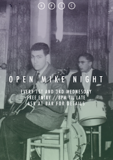
I have designed this fold out poster to be distributed in freshers packs such as the Don't Panic packs distributed throughout Leeds in shops and the universities. The function of this design is that it has a branded poster on the front and then unfolds to show the up and coming/regular events at the social. I have featured the two party nights and regular open mike night that I have designed the supporting posters for.
Invite designs
New invite designs for the residents of Ash Grove - I have reworked the old design in the new style that I have come up with that is consistent with the identity of the social promotional material. They are B7 size as I wanted to use a less common size rather than working to A format.
Vinyls and instore decoration/promotion
I have been working on the in-store vinyls for the 'Waitrose Picnic' range and promotion that I have designed. Unfortunately I was thrown out of Waitrose and Marks and Spencer for trying to take pictures after finding out that their store policy is that they do not allow photographs to be taken in store for any reason. This is frustrating in that I have designed the sinage and product packaging for Waitrose specifically and I wanted the mock up images to be as realistic as possible. Eventually I managed to get some images inside Co-op without being stopped!


I have photoshopped out the most obvious elements that show that it is not Waitrose, and dropped in my vinyl designs where I intend them to go....
Ponya website modifications
Following the advice and feedback I received from the last crit, I decided to make the following changes to the website design for the Ponya product range:
1) Change the background - it was agreed in the crit that the existing noise heavy background was too distracting and was taking the attention away from the products. I have changed this to a simplistic white background and made the boxes which the product images are contained in slightly darker.
2) It was also discussed that I needed to specify where the product is found - not necessarily photograph the products in shops, but more specify which shops it could be found (other than the online shop). I have added a 'stockists' tab to the website which contains a list of shops where the product can be found in the form of a concession, as well as a submission form for potential wholesale partners which was something I found from my research that a lot of similar brands do have on their websites.


Ponya website changes
Following the advice and feedback I received from the last crit, I decided to make the following changes to the website design for the Ponya product range:
1) Change the background - it was agreed in the crit that the existing noise heavy background was too distracting and was taking the attention away from the products. I have changed this to a simplistic white background and made the boxes which the product images are contained in slightly darker.
2) It was also discussed that I needed to specify where the product is found - not necessarily photograph the products in shops, but more specify which shops it could be found (other than the online shop). I have added a 'stockists' tab to the website which contains a list of shops where the product can be found in the form of a concession, as well as a submission form for potential wholesale partners which was something I found from my research that a lot of similar brands do have on their websites.
Saturday, 26 November 2011
Wednesday, 23 November 2011
Two final decisions
I had a mini crit with a few peers about my final designs which helped speed up my decision making process and refine my choice to these two designs.

After some consideration I have decided I think that the non-italic letters work better as I feel that the slanted letters as well as the circle outlines becomes too much visually.

final variations....
After reflecting on my print outs I wanted to try a few different variations of the circular emblem I have been using accoss the designs. I like the logo, but I don't think that it is quite perfect yet.
I have tried a number of variations and applied them at different sizes and opacities. I am going to choose one and then stick with it for the further designs as I don't want to spend any more time on this aspect of the brief.
I have tried a number of variations and applied them at different sizes and opacities. I am going to choose one and then stick with it for the further designs as I don't want to spend any more time on this aspect of the brief.
Tuesday, 22 November 2011
evaluating my designs so far....
I printed some of my favourite designs so that I could see how they translate to print - and newsprint stock which is my preferred stock choice for this brief. I think newsprint delivers a low-fi aesthetic that suits the establishment I am promoting.

On printing these designs I am less certain as to whether I like the circular motif - I have brainstormed some ideas with some of my peers and I think I am going to test some other shapes and options for the letters. Everyone agreed that the consistency is up to scratch so that is one goal I have achieved (so far anyway)....


Halloween poster
As part of the reworking of my designs for the Hyde park social I plan to redo the existing posters for nights I was asked to design for - here I have been working on a Halloween poster, only applying the new style I have created for the promotion. The elements that are consistent throughout are the indigo colour, use of gradient, HPSC letters/circles, Futura condensed light (with tracking increased), and the use of strange/humorous/vintage imagery.
Main hyde park social poster development
I'm still working on the main identity poster for the social - I have developed this four circle design that acts as a kind of logo through the posters. The social has the letters H P S C above the main door and I like how this relates to the poster in this way.
Other ideas for Social poster
Progress so far..... I have explored most of the ideas I had now.... It's just a case of choosing which bits work and finalising the design...
Hyde park social poster
I am working on a design for a poster/flyer for the Hyde Park Social. I plan to take on the ideas that I think work from my designs for them so far as a live brief working for a client, and my own personal inspirations and ideas to create a new design. I will then apply this style to the range of promotional material I have designed for so far, so that they work as a set. This will be my final outcome. I have been looking at contemporary graphic design posters as well as Russian constructivist graphic design as the inspiration for the type and layout and looking at vintage imagery for the image aspect of the design - to reflect the style and atmosphere of the club. At this stage my ideas are mainly experimental but I am working on producing something more refined....
Monday, 21 November 2011
In store graphics
I need to provide a range of designs for in-store graphics to help consumers to become aware of the Waitrose picnic promotion I am designing for. These graphics could be floor graphics, shelf graphics, Fridge graphics, hanging graphics wall graphics. I am going to head down to Waitrose tomorrow to take some photographs and see how they use their graphics and where they are placed.......
Packaging mock ups
I have been experimenting with potential packaging designs for a small range of products that would actually be branded with 'Waitrose Picnic' such as 'mini' foods. I think that these mock ups are relatively succesful although I would like to make up the packaging for perhaps two or three of these designs so that I could take some high quality photographs for my boards to help better illustrate how this would be applied....
Sticker designs and mock ups
This is my design for stickers that would be used across the store in Waitrose to indicate products that are related to picnicking and are part of a 3 for 2 promotion. I used the gingham and the doily shape as well as the same two typefaces used across the recipe cards to ensure consistency across the whole picnic promotion. I chose a circular sticker as this is one of the least invasive shapes to place on products that already have significant information on the packaging informing the consumer about the product.
Working with the Waitrose brand
I have been working on how to work with the Waitrose brand effectively - after some research I found that the Waitrose typeface is a custom typeface not readily available for public use - however it is based on Futura Md Bt which I was able to get hold of.

I altered the tracking to try to achieve the most accurate replication of the Waitrose type. I am ultimately using this for the body text of the Picnic recipe cards as well as the 'Waitrose Picnic' identity that I am creating. I am using sky blue rather than the brands usual green, because after some research I found that they change the colour of the logo depending on the range (e.g. 'Waitrose Summer' and 'Essential Waitrose').

I created this doily stye shape to use as a template for the logo to sit in and to transfer across other elements of the promotion. I think that it represents the 'British' spirit of picnicking and works well with the gingham.
Recipe card development
I decided to vectorize the banner from my previous design and I think this is much stronger visually. I also decided to adjust the tracking so that the recipe title fills the space of the banner better. As well as this I decided to add some gingham to the composition. The red gingham element of my designs has been an element that I have liked consistently, as in my opinion it says 'Picnic' better than any other pattern/flat colour. I think these gingham boxes help to balance the composition. I have decided to scrap the illustrations for the recipes as I feel that there is just too much going on visually - I think the gingham works better and has become the main visual - I think any more image will over crowd the designs.
Identity development
In order to put my work for this brief in context, I have decided that these designs will be part of a Waitrose picnic foods promotional campaign - seasonal - potentially inline with the pending Olympic games.This was something that was discussed in the crit, and I feel is a good idea and will make this brief more rounded and realistic.
I have been working on the identity for the picnic range and promotion. I want to stick to this simple colour palette of red (used at different tints for the gingham), white and blue, for which I am using 15% and 30% Cyan with no other inks to lower commercial printing costs (should this be a real brief). This was something that was mentioned at the Generation Press talk - where possible use 0% on less prominent CMYK colours if you can.

I have been working on the identity for the picnic range and promotion. I want to stick to this simple colour palette of red (used at different tints for the gingham), white and blue, for which I am using 15% and 30% Cyan with no other inks to lower commercial printing costs (should this be a real brief). This was something that was mentioned at the Generation Press talk - where possible use 0% on less prominent CMYK colours if you can.

The final slide is what I am going with as the final identity for this brief - time is running out and I have already spent too much time on this. I need to make some decisions and go with them. I may remove the bunting but other than that, this is the final illustration. This will be used for the reverse of the recipe cards as well as possibly part of the floor/wall in store graphics at Waitrose.
Thursday, 17 November 2011


Tuesday, 15 November 2011
Layout experimentation
I have been experimenting with layout for my recipe cards. I have been experimenting with B6 landscape as a size (not clear in the pdf below) - and also B6 portrait, but I definitely prefer the landscape option in terms of composition.
Monday, 14 November 2011


Re-working hyde park social work
To further this brief, I am going to re-work all of the designs that I have done for this brief so that they work together as a set, and create a set of pieces that reflect my personal style of design and that I feel proud of, rather than sticking to fulfilling the specification of my client.


One idea I am working with at the moment is limiting the colour palette to black and white plus one colour used at an opacity.

Subscribe to:
Posts (Atom)