
Showing posts with label Additional Briefs. Show all posts
Showing posts with label Additional Briefs. Show all posts
Wednesday, 14 December 2011

Tuesday, 13 December 2011
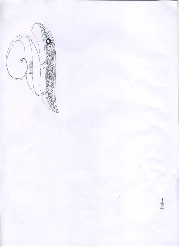
Illustrated type
Piece of illustrated type I have been working on for a christmas gift - I plan to develop this design and then screen print the design which I will then frame. I might experiment with using flock FL as a binder to create an interesting texture.


Monday, 12 December 2011
Warner ep cover and typeface


As well as the cover I decided to develop the type I had designed for the band name into a full typeface :

Wednesday, 30 November 2011
4 design variations sent to Warner
These are the final 4 variations that I have sent to Warner and the band for feedback. I am expecting to have to make some changes, but I will have to wait and see what there response is....
I am going to work on the design for the reverse once I have got approval for the front and have the exact sizing details.
I am going to work on the design for the reverse once I have got approval for the front and have the exact sizing details.
development
This morning I reviewed the work and decided that I might try a different typeface. As the design is hand drawn this will mean redrawing the middle portion so that I can add different text on top. I experimented with the fill content aware tool but it didn't work too well so I redrew this area and experimented with a new typeface I acquired off Chris which I think will work well with the aesthetic of the design. I ended up customising the type and removing elements of it which I think works really well and looks really contemporary.
Mannakings ep
Feeling altogether displeased by almost everything I have done so far, I decided to rework the only design I like. I reviewed it and decided to expand on the design - make it more visually interesting and more imaginative, rather than sterile and repetitive as I felt it was at that stage. I like the new version so far, and have experimented with a variety of different background textures rather than images which I think works better.
Monday, 28 November 2011
Initial designs
This is my starting point for the Warner ep..... I have initially used the idea of eyes as one of the tracks is called the sky of my eyes. I have created my own hand drawn type for the design which I think works, although I am not sure that the design as a whole is working. I want to be able to send them at least 3 minimun designs so that they have a choice and are more likely to like one of them, as I understand that Warner will have to approve it and there could be alterations to be made.
Ideas for Warner EP
I have started brainstorming for my Warner live brief as the deadline is Wednesday for this. My starting point was to look at the 5 track titles....
Thursday, 10 November 2011
Hush house jumper design
I have been asked to design a christmas jumper for a music blog and collective called The Hush House. This is my initial sketch based on the brief I received...

Tuesday, 8 November 2011
WÅVEN Briefing


I got really excited about this brief but unfortunately I think I have too many projects on at the moment and I fell I personally need to focus on my core four briefs at this stage.
Tuesday, 25 October 2011


Friday, 21 October 2011

Reverse of price tags for book fair
I have been working on my designs for the reverse of the Ponya price tags (tote bags). I need to include the price and a link to my website. Although I am developing the brand identity as part of my project, as this is a live brief and an opportunity to network for the benefit of my own practice, I feel it is necessary to include some kind of link back to me. I played with a few ideas until I created something that I felt suited the style and the format of the tag. I plan to print them on vinyl sticker to add another texture (proposal would be that this would be die cut).
Thursday, 20 October 2011
Tags for bookfair/pop up shop
I bought this satin green card for my tags, however I quickly found that they would not stick to the white handmade paper I had used for the embossed side.

To be fair I found that I preferred the appearance of the tags when white with just the black vinyl cut out stuck directly onto the back so this didn't become a major issue.


Wednesday, 19 October 2011
Embossing/de-bossing tags
I used the laser cut template I made to emboss/deboss for the first time in the print room.


I was surprised at how quick it was to do and how much crisper the results were in comparison with hand embossing.


Tuesday, 18 October 2011
panda illustration
developing other designs for 'ponya' brand to be completed for pop up shop following feedback from the book fair.


Monday, 17 October 2011


embossing experiment


I am embossing the Ponya logo onto the tags that I am making for my tote bags. I experimented today buy hand which worked relatively well but isn't looking great. It also took me much longer than I had thought. For these reasons I have booked a lazer cutting session so I can make a tougher template and then use the press in the print room which will save time and give a better result.
screen printing tote bags


I'm pleased with how these have come out. At first I was annoyed at the flaws - as I used a small screen (trying to be cost effective) I found it difficult to reach the outer limits of the design which resulted in some faded areas such as the tips of the leaves. However, after my chat with Robbie Porter after his talk I feel much better. He said he felt that it added to the 'hand made' aesthetic and is what people buy into when they buy things like that. It was also really nice to do something practical and get my hands dirty.
Subscribe to:
Posts (Atom)