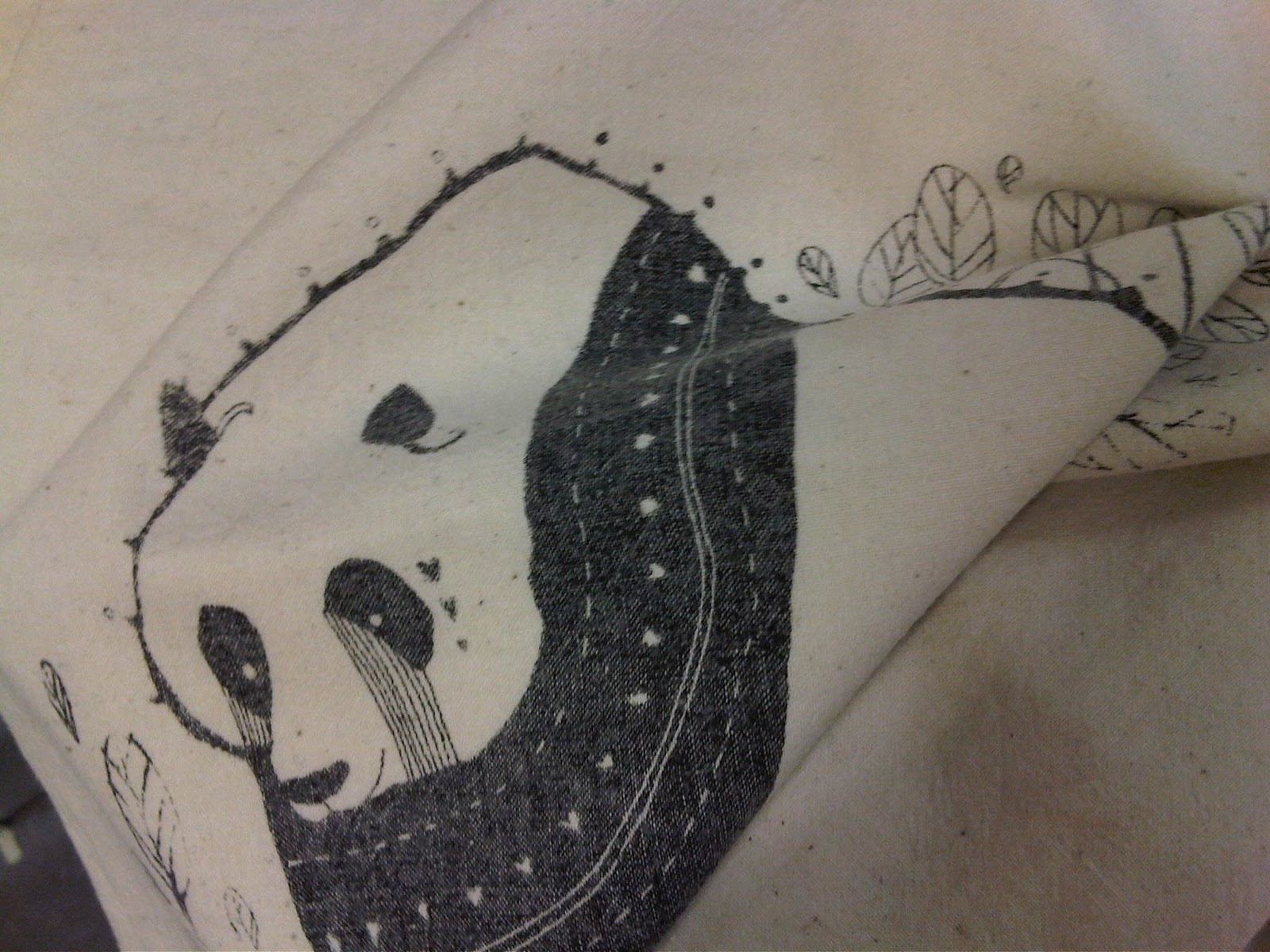
I sold all my Panda bags at the Pop up shop but unfortunately I forgot to save one for submission which was slightly stupid... luckily I had kept one for myself. I had to wash it as it had an unsavoury brown stain on it, which unfortunately caused the design to fade dramatically. This should not have happened, however next time I will heat press the designs after they are printed to help seal them better.
Showing posts with label Pop up shop. Show all posts
Wednesday, 14 December 2011
Washed tote bag
Thursday, 10 November 2011
Defining my deliverables for the Ponya brief
I have defined my deliverables for this brief to be:
-Website/online shop selling a range of Ponya products and raising awareness about how to help save pandas from extinction
-Five panda illustrations applied to a range of products
-Tote bags, christmas cards, post cards and wrapping paper (screen/digital print)
-Swingtags, stickers etc (branding elements)
-Mock ups for a range of other products including stationary, home ware, apparel and accessories.
Labels:
Book Fair,
BRIEF 2,
Design sheets,
ougd301,
Ponya,
Pop up shop
Tuesday, 25 October 2011
Manchester book fair
Friday, 21 October 2011
Reverse of price tags for book fair
I have been working on my designs for the reverse of the Ponya price tags (tote bags). I need to include the price and a link to my website. Although I am developing the brand identity as part of my project, as this is a live brief and an opportunity to network for the benefit of my own practice, I feel it is necessary to include some kind of link back to me. I played with a few ideas until I created something that I felt suited the style and the format of the tag. I plan to print them on vinyl sticker to add another texture (proposal would be that this would be die cut).
Thursday, 20 October 2011
Tags for bookfair/pop up shop
I bought this satin green card for my tags, however I quickly found that they would not stick to the white handmade paper I had used for the embossed side.
To be fair I found that I preferred the appearance of the tags when white with just the black vinyl cut out stuck directly onto the back so this didn't become a major issue.
Labels:
Additional Briefs,
Book Fair,
Branding,
ougd301,
Pop up shop
Wednesday, 19 October 2011
Embossing/de-bossing tags
I used the laser cut template I made to emboss/deboss for the first time in the print room.
I was surprised at how quick it was to do and how much crisper the results were in comparison with hand embossing.
Labels:
Additional Briefs,
Book Fair,
debossing,
embossing,
ougd301,
Pop up shop
Tuesday, 18 October 2011
panda illustration
developing other designs for 'ponya' brand to be completed for pop up shop following feedback from the book fair.
Monday, 17 October 2011
finished screen printed bags....
Labels:
Additional Briefs,
Book Fair,
ougd301,
packaging,
Pop up shop
embossing experiment
I am embossing the Ponya logo onto the tags that I am making for my tote bags. I experimented today buy hand which worked relatively well but isn't looking great. It also took me much longer than I had thought. For these reasons I have booked a lazer cutting session so I can make a tougher template and then use the press in the print room which will save time and give a better result.
screen printing tote bags
I'm pleased with how these have come out. At first I was annoyed at the flaws - as I used a small screen (trying to be cost effective) I found it difficult to reach the outer limits of the design which resulted in some faded areas such as the tips of the leaves. However, after my chat with Robbie Porter after his talk I feel much better. He said he felt that it added to the 'hand made' aesthetic and is what people buy into when they buy things like that. It was also really nice to do something practical and get my hands dirty.
Labels:
Additional Briefs,
Book Fair,
ougd301,
Pop up shop,
Screen printing
Wednesday, 12 October 2011
tag mock ups
I have mocked up the logo on thick grey stock to see what colours have the best impact.
I am slightly inclined to make the logo just the type with no surrounding decoration.
I think introducing another colour other than black will make the product more interesting as the tote bags will just be black and white.
I think pale pink is one of the most interesting contrasts.
I think a dirty white/grey colour could work well as the surface of the sticker will contrast with the rougher surface of the stock making it visible.
I think I might use variations of colour as part of the brand identity.
Subscribe to:
Posts (Atom)


