Showing posts with label type experimentation. Show all posts

Tuesday, 13 December 2011

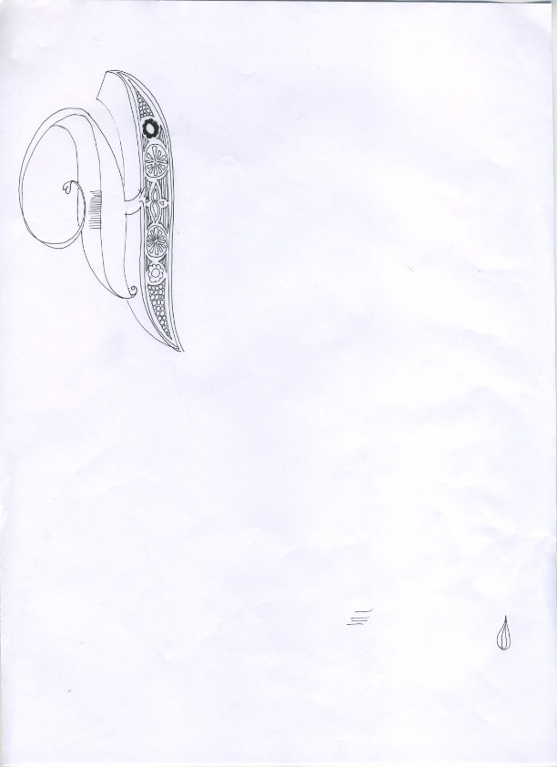
Illustrated type

Piece of illustrated type I have been working on for a christmas gift - I plan to develop this design and then screen print the design which I will then frame. I might experiment with using flock FL as a binder to create an interesting texture.


Monday, 12 December 2011

Warner ep cover and typeface


As well as the cover I decided to develop the type I had designed for the band name into a full typeface :


Wednesday, 9 November 2011

its not what you look at.....


I have been working on a design for a same colour cutout. The idea is to create a more subtle message. I experimented with a variety of fonts but I felt that Futura condensed light worked the best as it still works and reads comprehensively when the counters are removed. After some consideration I decided that the quote 'It's not what you look at that matters, its what you see' works better in terms of concept as it suits the subtlety of the aesthetic. I think that it could work well landscape to go across a double page spread in the publication.