
Showing posts with label BRIEF 7. Show all posts
Showing posts with label BRIEF 7. Show all posts
Wednesday, 14 December 2011

Tuesday, 13 December 2011
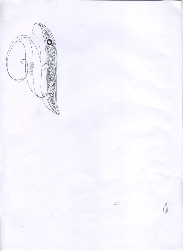
Illustrated type
Piece of illustrated type I have been working on for a christmas gift - I plan to develop this design and then screen print the design which I will then frame. I might experiment with using flock FL as a binder to create an interesting texture.


Monday, 12 December 2011
Warner ep cover and typeface


As well as the cover I decided to develop the type I had designed for the band name into a full typeface :

Wednesday, 30 November 2011
4 design variations sent to Warner
These are the final 4 variations that I have sent to Warner and the band for feedback. I am expecting to have to make some changes, but I will have to wait and see what there response is....
I am going to work on the design for the reverse once I have got approval for the front and have the exact sizing details.
I am going to work on the design for the reverse once I have got approval for the front and have the exact sizing details.
development
This morning I reviewed the work and decided that I might try a different typeface. As the design is hand drawn this will mean redrawing the middle portion so that I can add different text on top. I experimented with the fill content aware tool but it didn't work too well so I redrew this area and experimented with a new typeface I acquired off Chris which I think will work well with the aesthetic of the design. I ended up customising the type and removing elements of it which I think works really well and looks really contemporary.
Mannakings ep
Feeling altogether displeased by almost everything I have done so far, I decided to rework the only design I like. I reviewed it and decided to expand on the design - make it more visually interesting and more imaginative, rather than sterile and repetitive as I felt it was at that stage. I like the new version so far, and have experimented with a variety of different background textures rather than images which I think works better.
Monday, 28 November 2011
Initial designs
This is my starting point for the Warner ep..... I have initially used the idea of eyes as one of the tracks is called the sky of my eyes. I have created my own hand drawn type for the design which I think works, although I am not sure that the design as a whole is working. I want to be able to send them at least 3 minimun designs so that they have a choice and are more likely to like one of them, as I understand that Warner will have to approve it and there could be alterations to be made.
Ideas for Warner EP
I have started brainstorming for my Warner live brief as the deadline is Wednesday for this. My starting point was to look at the 5 track titles....
Subscribe to:
Posts (Atom)