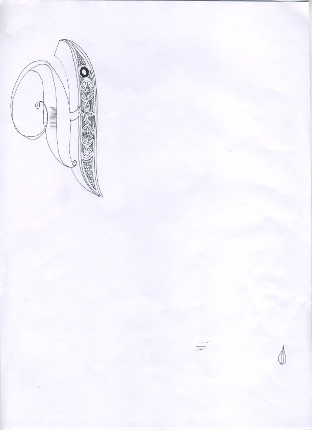
Piece of illustrated type I have been working on for a christmas gift - I plan to develop this design and then screen print the design which I will then frame. I might experiment with using flock FL as a binder to create an interesting texture.
Showing posts with label illustration. Show all posts
Tuesday, 13 December 2011
Wednesday, 30 November 2011
Mannakings ep
Feeling altogether displeased by almost everything I have done so far, I decided to rework the only design I like. I reviewed it and decided to expand on the design - make it more visually interesting and more imaginative, rather than sterile and repetitive as I felt it was at that stage. I like the new version so far, and have experimented with a variety of different background textures rather than images which I think works better.
Labels:
Additional Briefs,
Boards,
BRIEF 1,
BRIEF 4,
BRIEF 5,
BRIEF 7,
Collaboration,
illustration,
ougd301,
Waitrose Picnic,
Warner EP
Monday, 21 November 2011
Identity development
In order to put my work for this brief in context, I have decided that these designs will be part of a Waitrose picnic foods promotional campaign - seasonal - potentially inline with the pending Olympic games.This was something that was discussed in the crit, and I feel is a good idea and will make this brief more rounded and realistic.
I have been working on the identity for the picnic range and promotion. I want to stick to this simple colour palette of red (used at different tints for the gingham), white and blue, for which I am using 15% and 30% Cyan with no other inks to lower commercial printing costs (should this be a real brief). This was something that was mentioned at the Generation Press talk - where possible use 0% on less prominent CMYK colours if you can.
The final slide is what I am going with as the final identity for this brief - time is running out and I have already spent too much time on this. I need to make some decisions and go with them. I may remove the bunting but other than that, this is the final illustration. This will be used for the reverse of the recipe cards as well as possibly part of the floor/wall in store graphics at Waitrose.
Labels:
Boards,
BRIEF 1,
Collaboration,
illustration,
layout experimentation,
ougd301,
Waitrose Picnic
Thursday, 17 November 2011
Tuesday, 15 November 2011
Monday, 14 November 2011
Recipe card illustrations
I did these illustrations today to accompany the recipes.
Labels:
Boards,
BRIEF 1,
Collaboration,
illustration,
ougd301,
Waitrose Picnic
Christmas card designs
New illustrations
Working process for new panda illustrations....
I decided to design a festive panda as part of the range of illustrations so I can apply it to christmas cards to sell at the pop up shop. I am really pleased with the colours and the aesthetic - I don't want to use too typically festive colours so that my design stands out as a bit different.
Unfortunately, my computer crashed in between saves! So I lost this design which took me a lot longer than the others to get it just right. I re-did it yesterday but I am not 100% happy with the re-work, I think that I might re-do it if I have time.
Three other designs :
New panda sketches
Subscribe to:
Posts (Atom)