Module Title : Design Practice 3
Brief title : A professional practice
I have really enjoyed this module, particularly the second half. I think that following the good progress I made in the last module and getting my first 1st, combined with what I learnt about myself as a designer throughout the image module, I think that I have really started to establish my practice. I felt that the second part of this brief enabled me to really direct myself towards the design areas that are relevant and important for me, and that I really enjoy; such as illustrated type.
I have really enjoyed this module, particularly the second half. I think that following the good progress I made in the last module and getting my first 1st, combined with what I learnt about myself as a designer throughout the image module, I think that I have really started to establish my practice. I felt that the second part of this brief enabled me to really direct myself towards the design areas that are relevant and important for me, and that I really enjoy; such as illustrated type.
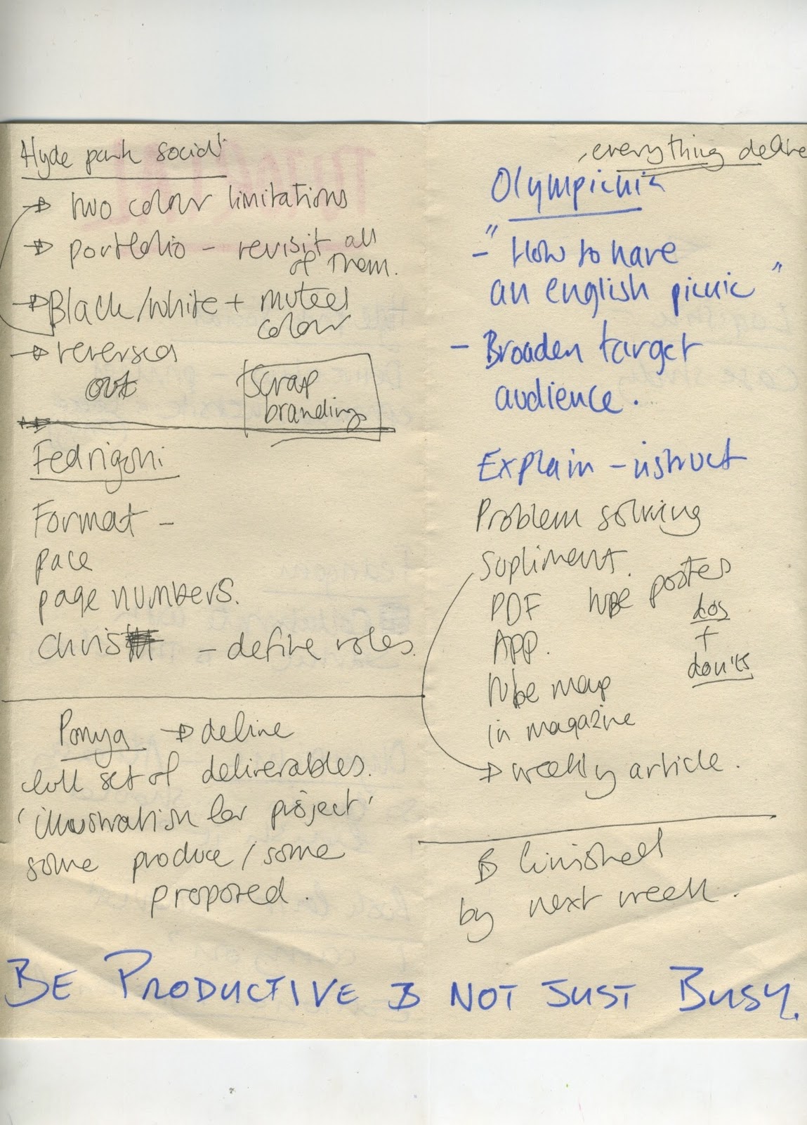
I think it took me a while to get to a point where I was managing my time effectively in this module. I really enjoyed the first half of it, but despite putting in long hours from week one and keeping really busy, I later realised I wasn't necessarily being as productive with my time as I could have been. This was brought to light in my second tutorial, however following that tutorial I actively sought to better organise my time and really think about what I needed to do in the time that I had left available. I think that this is evident in my work from this point onwards and I became a lot more productive with my time management. I only wish that I had picked up on this earlier on in the module, this is just something that I will know to be more aware of next module.
SKILLS ACQUIRED/DEVELOPED
This module I feel that I have progressed in a few different areas. My software skills have improved a lot simply from spending more and more time with the programs, particularly Photoshop and Indesign. I also experimented with Fontographer earlier on in the module which I had not previously used.
SKILLS ACQUIRED/DEVELOPED
This module I feel that I have progressed in a few different areas. My software skills have improved a lot simply from spending more and more time with the programs, particularly Photoshop and Indesign. I also experimented with Fontographer earlier on in the module which I had not previously used.
The live project for the Hyde Park Social Club has been extremely valuable to my development this module. Firstly it enabled me to have my first extended experience with a client (rather than one-off jobs like I have done in the past. Having someone dictate copy and often art direction to some extent, lay down boundaries that I had to work around which helped me get used to a more realistic way of working. Working on a brief each week that often I only had a couple of days to get completed meant I had to work more quickly than I was used to and meant that I developed a slightly different, more systematic way of working. In addition to this, having to work with type and layout forced me out of my comfort zone and really helped me to develop in these areas as the module progressed. I wasn't able to use image as the main communication device like I might have done as often there was a lot of copy to work with. I also found that laying out my submission boards was a lot easier this module, which I think is a direct reflection of me feeling more confident with my layout abilities.
I have really enjoyed the web design sessions this module and I feel that I have learnt a lot in a short space of time. I have applied this knowledge to my proposed website designs for my projects but I think I need to apply these skills on a more practical level (such as completing my personal website.)
My knowledge of processes has improved this module. I have spent more time in the print room than I have in any previous module and I felt that it meant I could stretch my deliverables that bit further. I also found that being in a more hands-on craft based environment working with physical elements rather than software helped me to keep my imagination open to more ideas in terms of stock, process and finishing. This is certainly something that I want to carry on for the next module.
Working on multiple briefs was a big learning curb this module. I think I have learnt a lot about how to structure my time and how many briefs I can realistically work on at one time.
The collaboration was also great experience as it enabled me to do some work that I was really keen to do and create some custom 3d type, but also helped me experience working with someone else who could do the type and layout better than I could and provide the context for my work. It meant I had more time to work on an area that I am really interested in and had not done much design like this all module. I felt that Chris and I worked really well together and I could definitely work with him again.
In terms of my general practice, I think I improved my ability to apply illustration to an appropriate context. I don't think I have completely hit the nail on the head, but I think that I am getting there and that next module should see even more improvement in this area.
STRENGTHS :
I think my strongest area this year has been my dedication to the course. I have spent more hours in uni than I have at home, and without resenting it. Although my time has not necessarily been spent in the most productive way, I have managed to keep motivated and enthusiastic about my work throughout this module, in spite of things not working out all of the time.
I think that my blogging has been as consistent as it has been throughout the last few modules. I have blogged systematically on a daily basis and I think that this as well as my constant evaluation helps to communicate my working process as well as helping me to reflect on what I am doing on an hour by hour basis.
I really struggled at points with one particular brief, however I think I really progressed in the way that I have turned it around towards the end into something that I am moderately happy with. I can see where I went wrong now, but it was good experience to learn how to handle things when a brief doesn't end up taking the direction I am hoping it to.
I think that my use of layout and type has been stronger than its ever been in the past this module. I still have a lot to learn as I'm still not producing the standard of work that I want to, but I think the more work I put in and the less intimidated by it I am, the closer I am to getting to that point.
I think my approach to applying illustration to a design was also stronger this module than it has been in the past and I hope to continue improving in this area.
Although my time management was not that successful for all of the module, I think that in a lot of areas I was really well organised and equipped to handle certain areas. I planned all my printing in advance and didn't once miss out due to poor organisation.
WEAKNESSES :
My main weakness this module was my lack of focus for the first half of the module. I was busy, but I wasn't productive and I am sure that I have wasted a lot of time as a result of this. I imagine this has a lot to do with coming back after the Summer, as well as having to work in a more self-directed way than we ever have in the past. The main thing to consider is how to avoid this happening again. I plan to counter-act this effect by continuing to work on a couple of self-initiated projects over Christmas. I also plan to refer back to my rationale more often and make sure that I am getting what I want and need out of everything I do, rather than letting ideas run away with themselves.
I was disappointed with what happened with my Picnic brief. I think this is a prime example of falling in love with my idea and veering away from my rationale. I ended up designing for some things that I am not particularly interested in designing for. I didn't play to my strengths and I think that this shows a little in my deliverables. I think my attitude was pretty negative towards this in that I wanted to scrap the brief and start a new one, when if this was a client, that would probably not be an option. I am glad that I stuck with it and worked through the problems. Although the designs aren't as strong as I had hoped for I think that the brief turned out to be relatively well developed and considered in terms of deliverables.
Things from OUGD301 that I want to continue to develop in FMP:
This module has however helped me to define the areas I definitely don't want to work with - typeface design,
Applied illustration - I want to work more with this area and how to apply it to design appropriately as I think that this is one of my strongest areas and certainly one of the areas I get the most pleasure out of.
Do more drawing - In order to further my illustrative practice I think that I need to do much more drawing than I do now. I need to set aside some time each week or even each day to do some drawing to keep in practice and to keep developing this skill. I think that this will aid my ideas generation.
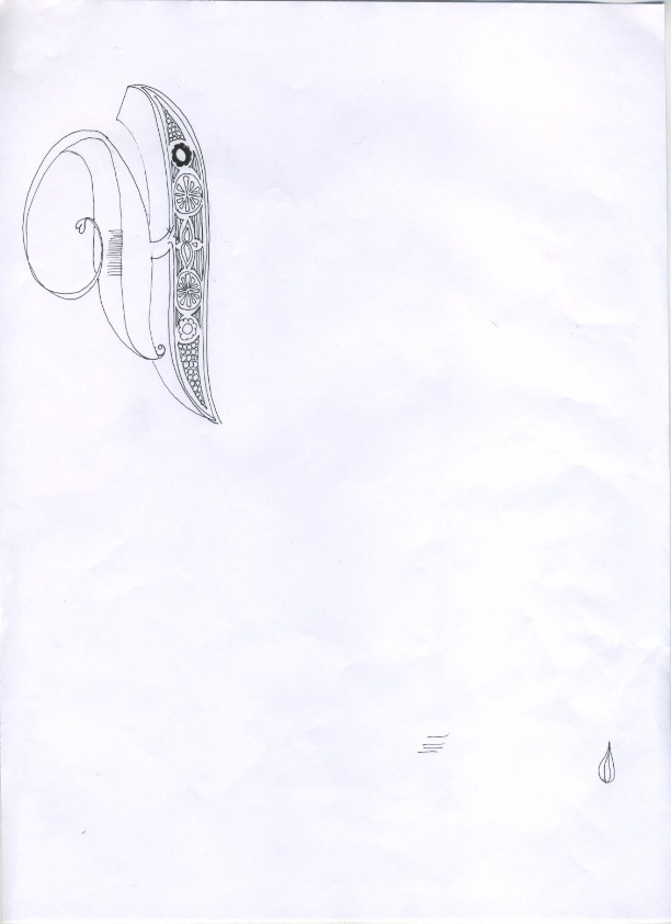
Custom typography - Illustrated/hand drawn/3d/image driven type - This is an area that I got really into at the end of last year and over the Summer but have only done a small amount of this module. It is definitely something I enjoy and want to make sure at least a couple of my briefs for my FMP incorporate this kind of design. This module has helped me to realise that designing full typefaces is not really the kind of work I want to be doing. In most cases, I feel that the kind of type I like designing is not really appropriate as body text and therefore it isn't really worth designing the full font.
Working with brands - but NOT branding. This module has helped me realise that full branding projects are not an area that I want to work in, however working with a brand - such as applied illustration is something that I am more interested in.
Process/Finishing - I have become a lot more interested in print processes and finishing techniques this module and I think that these areas could enhance my practice in many ways next module.
Web design - I have enjoyed the web design sessions I have had this module, but I think that I need to apply these skills to some practice. Over Christmas and next module I want to continue building my own website while I still have the opportunity to pick Simon's brains as I think that web design is a really useful and profitable skill to have - particularly when I leave if I am not able to find employment straight away.
How I would grade myself on the following areas:
5= excellent, 4 = very good, 3 = good, 2 = average, 1 = poor
Attendance 5
Punctuality 5
Motivation 5
Commitment 5
Quantity of work produced 4
Quality of work produced 3
Contribution to the group 4
Time 11:06 Wednesday 14th December 2011