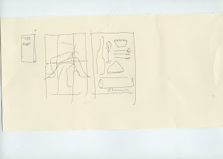
At the moment I am working on the identity for my Olympicninc concept.
I have developed this plaid from the olympic ring pantones although I'm not sure that it's working at the moment. I am also experimenting with british fonts like gill sans to give a patriotic feel and to reflect London transport.
I actually intend to design a themed tube map for the event and potentially a small publication....
I have also been working on a more friendly hand drawn aesthetic for the logo...
I wanted to merge these two ideas which I think works fairly well, although I think the detail of the plaid is slightly lost in this design.
I think I might try to merge the hand drawn product illustrations with the traditional british typography in an attempt to achieve both aesthetics.


No comments:
Post a Comment