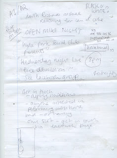
I have been asked to design the flyers for and open mike night at the Hyde Park Social Club. This will be a fortnightly event. I spoke to the client on Sunday and got the copy and a description of what he wanted. He liked the work I was doing for the social already so he was happy to keep it similar to that. He specified that he wanted a clean cut appearance - rather than the stereotypical tacky pub karaoke style poster. He says that once he starts profiting from the event, I should too.
To start with I played with the identity for the club that I have started to establish through the other flyers. He specified black and white as a colour scheme so I am working like this at the moment.
Notes from meeting :
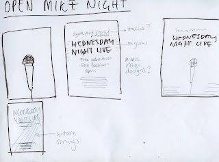
Initial designs :
He mentioned a specific image of Keith Richards that he wanted but I can't find it at the moment so am waiting to here more about that. I found this image which I think represents the atmosphere of the social club as well as the Keith Richards theme. However, he intends to print these posters on an a1 or a2 scale so finding an image of a high enough resolution may be tricky.
Microphone idea :


No comments:
Post a Comment