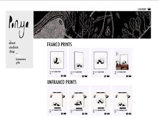
Following the advice and feedback I received from the last crit, I decided to make the following changes to the website design for the Ponya product range:
1) Change the background - it was agreed in the crit that the existing noise heavy background was too distracting and was taking the attention away from the products. I have changed this to a simplistic white background and made the boxes which the product images are contained in slightly darker.
2) It was also discussed that I needed to specify where the product is found - not necessarily photograph the products in shops, but more specify which shops it could be found (other than the online shop). I have added a 'stockists' tab to the website which contains a list of shops where the product can be found in the form of a concession, as well as a submission form for potential wholesale partners which was something I found from my research that a lot of similar brands do have on their websites.


No comments:
Post a Comment